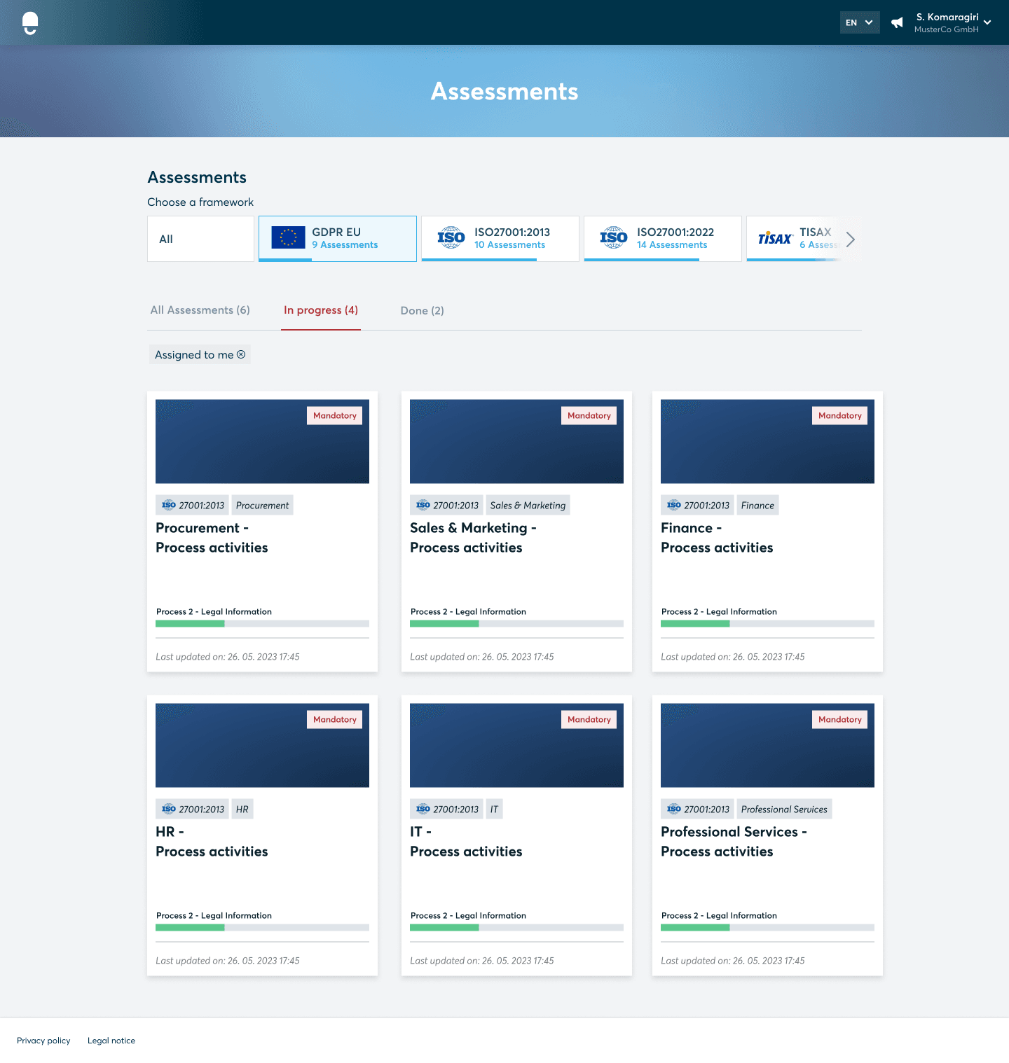
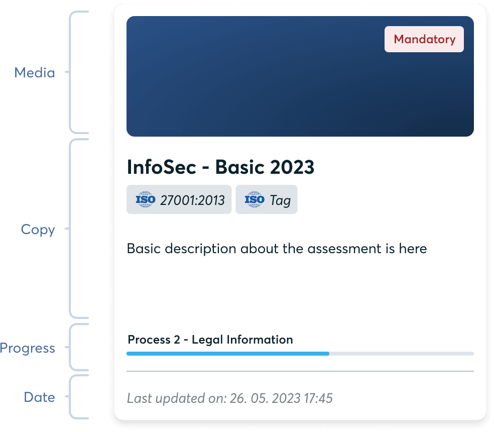
Cards
Cards serve as surfaces for presenting content and actions related to a specific topic.
Cards should facilitate easy scanning of relevant and actionable information. To indicate hierarchy, ensure that elements like text and images are appropriately placed on the cards.
A card usually consists of a rectangular container that contains specific content, such as text, images, buttons, icons, or any other relevant elements.
Guidelines:
- Define the purpose and intended use of cards. Clarify when and where cards should be used, considering their effectiveness in presenting specific types of content or interactions.
- Identify the different variations of cards based on their functionality and content, such as feature cards, content cards, image cards, or action cards.
- Define the interactive elements within cards, such as buttons, links, or icons, and establish guidelines for their appearance, placement, and behavior.
- Specify hover or active states for interactive elements to provide visual feedback to users.
- Define responsive behaviour, such as stacking cards vertically or horizontally, based on available space.