Writing guidelines
These guidelines help create consistency across our platform for common experiences.
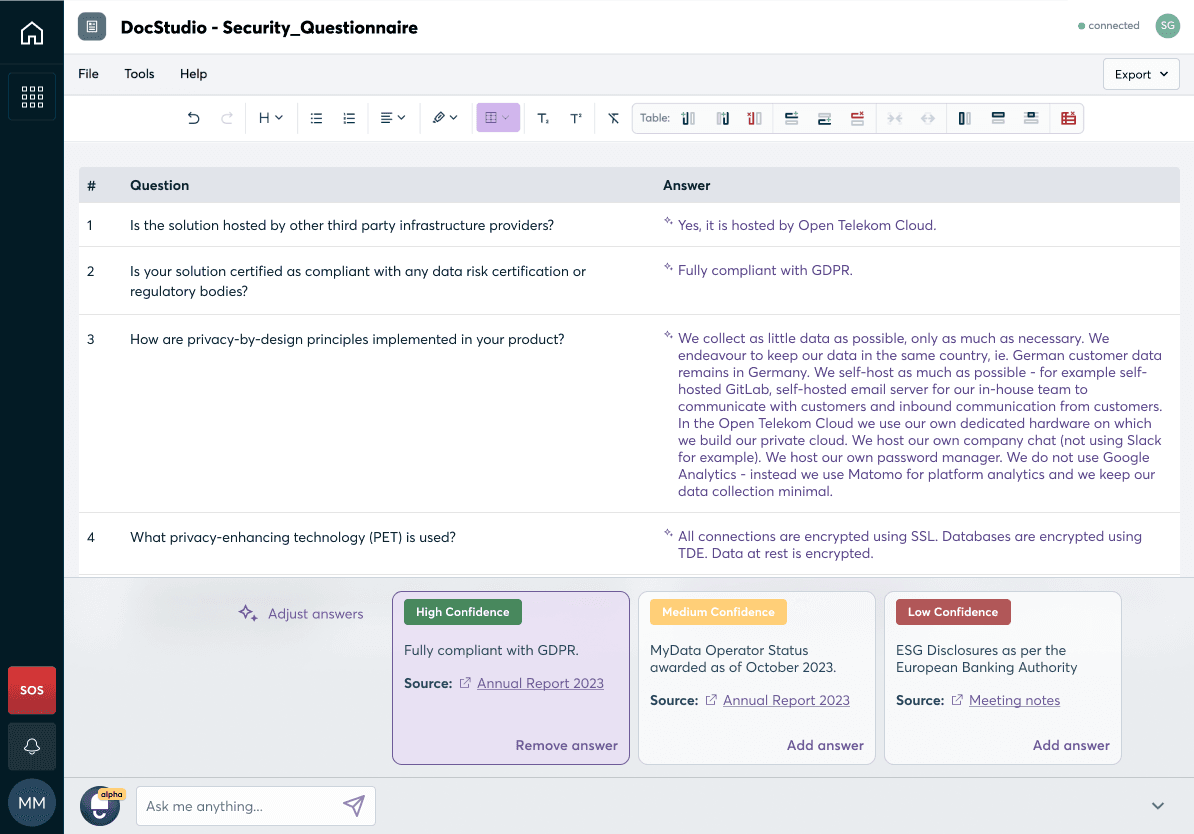
Artificial Intelligence (AI)
AI-powered suggestions enhance the user experience by providing personalised recommendations, guidance, or assistance based on the analysis of user data.
AI-powered suggestions should be used to help users' complete tasks more efficiently by suggesting relevant actions or providing shortcuts. AI-powered suggestions can also assist users in discovering relevant articles, videos, products, or other types of content, or to make better informed decisions by providing relevant information, comparisons, or recommendations.
Guidelines
- Use clear and concise language for suggestions. Ideally, start each suggestion with a verb (e.g. “Generate”, “View”, “Prepare”, etc)
- A suggestion must always be linked to at least one follow-up action or task.
Empty States
Empty states are the screens shown to the user when there is no content or data available to show them. Empty states can exist for various reasons, and they aren’t always a bad thing. However, you should be aware that users might feel confused or annoyed that a screen is empty. Use this as the perfect time to prompt the user to take action, or explain to them why the screen they are looking at is empty.
Guidelines
- Use an illustration or icon in an empty state. This attracts the users attention to your message.
- Provide a reason for the empty state. This can differ depending on the context, but it should explain why the state is empty in friendly language.
- Provide a call-to-action for the user. This should prompt them on what to do next.
DO
Guide the user to their next action
DON'T
Present the user with a dead end
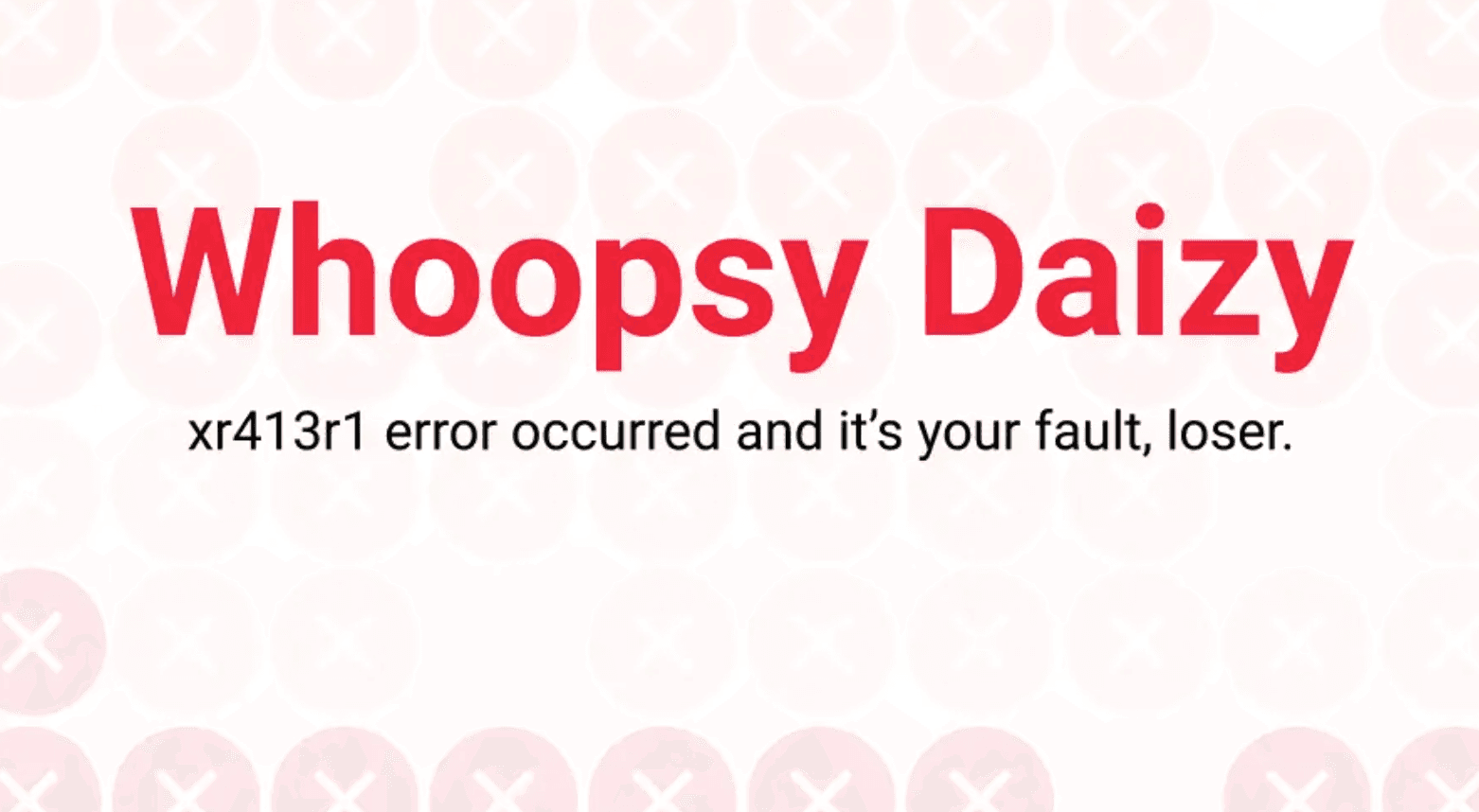
Error Messages
Errors are an unavoidable part of using any software. After an action has a occurred which results in an error, an error message should appear. The message should draw the user's attention to what happened and what the consequences are, before guiding them in the most painless way possible back to their original task.
Guidelines
- Use clear and concise language to explain what happened and what the user should do next. Avoid using terms like “oops” or “whoopsie” as they are overused and may not be understood by people who don’t speak English as a first language.
- Don’t blame the user for the error. Avoid using pronouns “you” and be conscious of how words like “wrong” or “nope” can push feelings of blame onto the user.
- Keep UX microcopy human and unambiguous. Don’t write like a robot or use overly technical terms. Ask yourself: would a person who rarely uses software understand what this means? Use inline validation for UX microcopy wherever possible.

DO
Explain what happened like a human would
DON'T
Blame and confuse the user
Discovery
Discovery messages explain a new or recently updated experience/app. It helps users to try something new or guide them through something that has changed.
There are two possible experiences here: an informative experience or an educational experience.
**1. Informative experience: **Should be used when the user just needs a step-by-step guide to understand how the experience works. They don’t need any background knowledge on the subject matter (e.g. Task Management)
**2. Educational experience: **The user may also need some guidance on the subject matter (e.g. Data Subject Requests). In this case, it’s not just about how the experience to handle a Data Subject Request works; the user could also lack education on what Data Subject Requests are in general - so we need to support them and provide these resources.
Guidelines:
- Gainsight is a key way to provide these experiences. Informative or educational Gainsight engagements should appear every time the user lands on the experience/app for the first time.
- The Gainsight engagement should always be skippable - some users won’t need it.
- Links to help or support resources should always be available, even if the user is using the app for the 100th time. They should be available in an easy accessible but non-distracting way.
- Informative experiences can be supported through short info boxes, help articles and platform tours.
- Educational experiences can be supported with short info boxes, help articles, video demos, or content/animated videos to explain the topic.
- When an app or experience changes, consider what the user needs to know. If it changes their workflow, a Gainsight engagement or additional supporting resources may be required.
Info Messages
Info Messages provide more information to users without disrupting their work or requiring them to take action. As such, these messages can easily be ignored if not needed.
Guidelines:
- Get right to the point
- Say why it's important, then let the user get back to work
- Keep the information useful and don't disrupt your users experience with the message
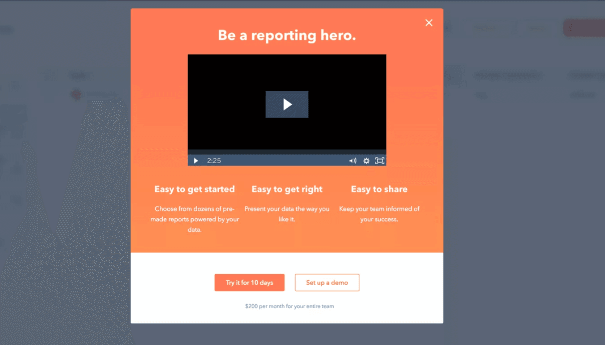
Promotional Messages
Promotional messages in our platform advertise a product, event, or special offer to users. This is a prime opportunity to grab the users attention.
Guidelines:
- Make it count: As promotions are used sparingly, make sure you use the opportunity to generate excitement
- Sprinkle some magic with emojis 🦄
- Animations, illustrations and glowing elements can also be used to generate excitement
DO
Provide a clear call to action
DON'T
Overwhelm the user
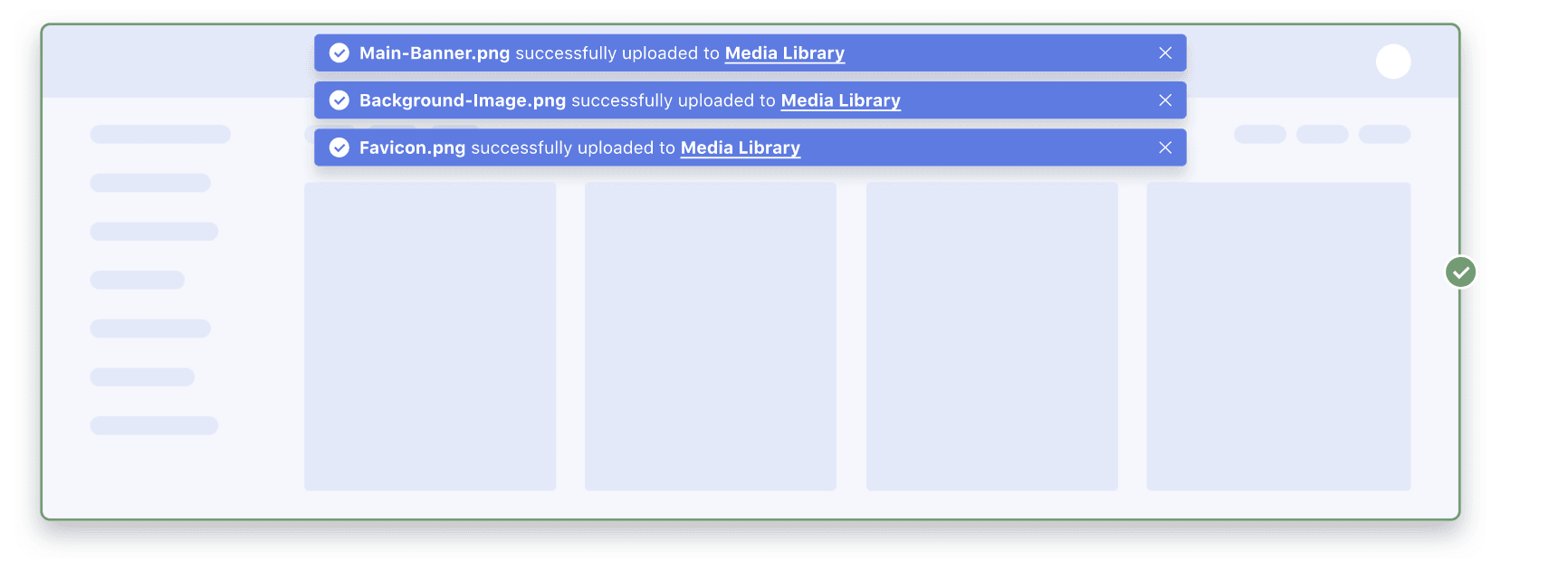
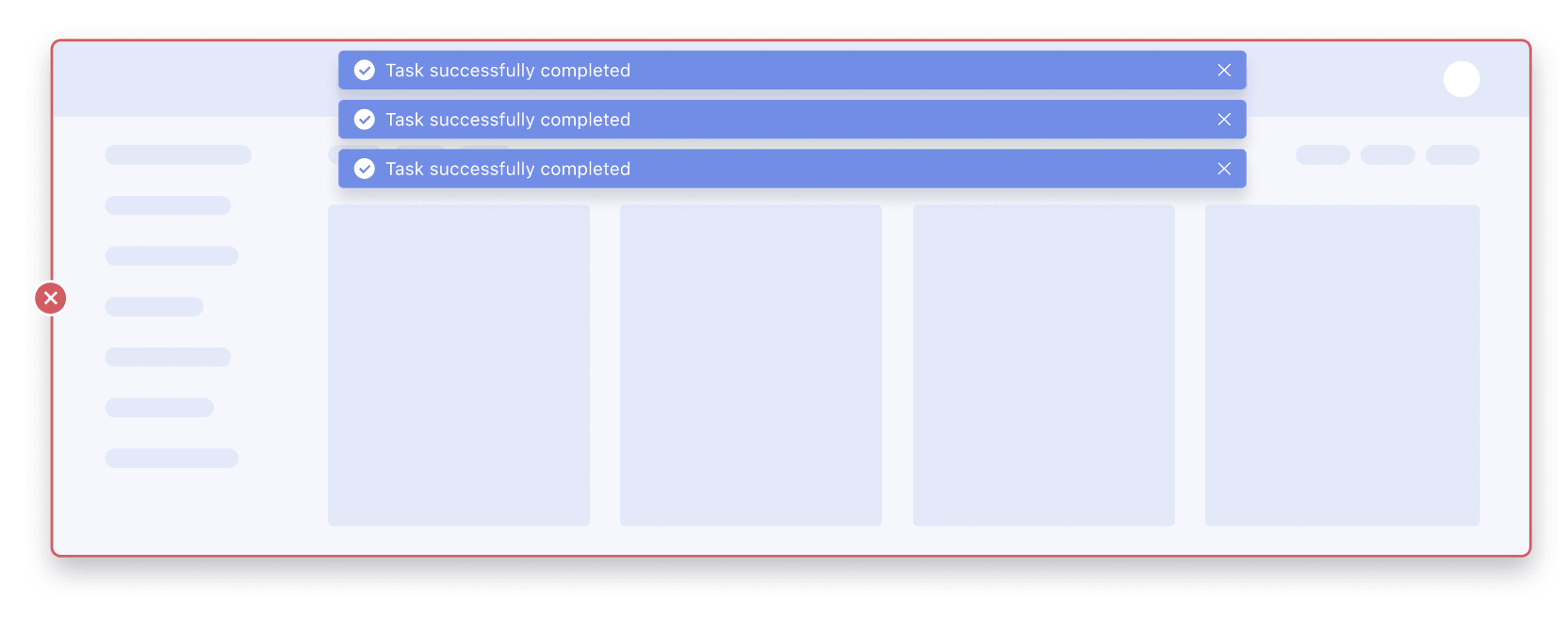
Success messages
A success message appears after someone has taken an action or completed a task. The message is an opportunity to confirm the action or congratulate them.
Guidelines:
- Avoid using generic statements like “Success!" Instead, specify the what was successful: “Policy generation complete!"
- Often, a success message should be simple with no title or call-to-action. Only use headlines and call-to-actions if absolutely necessary for the action.
- When a success message invokes a choice, use imperative verbs such as “Save”, “Remove” or “Create” in the call-to-action to describe what action people will be making.
- Avoid putting technical information in the message or having people look in another location. If it can't be avoided, use a “Learn more” link.
- Keep messaging clear and concise. Less is more. Remember, most people scan text instead of reading.
DO
Be specific about what happened
DON'T
Be vague
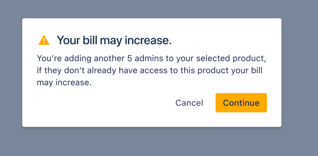
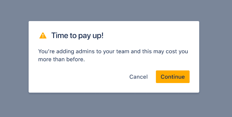
Warning messages
A warning message, different from error messages, appears before someone takes an action to indicate a significant change or potential loss of data. It draws their attention to a potential problem that may or may not require an action on the user’s part.
Guidelines:
- Keep messaging clear and concise. Less is more. Remember, most people scan text instead of reading. This is even more important for warning messages.
- Include: the reason for the warning and the potential problem, how someone should act, and what happens if they don’t act.
- If you don’t know the reason for a warning, don’t make one up – just say that something’s gone wrong and offer a solution for what they can do.
- Use ‘we’re' instead of ‘you’re' to avoid blaming users for issues they may be facing with the products.
- Risky action warnings (e.g. deleting data) should ask users whether they want to proceed, explain any reasons why they may not wish to proceed, and offer commit buttons for proceeding or canceling an action. You should always inform them whether any actions they take can be easily undone.
DO
Include an informative, scannable title
DON'T
Use negative or unclear copy