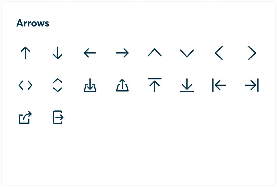
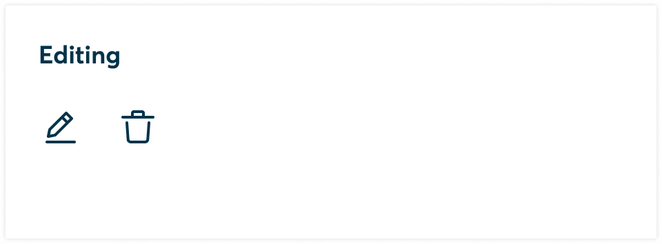
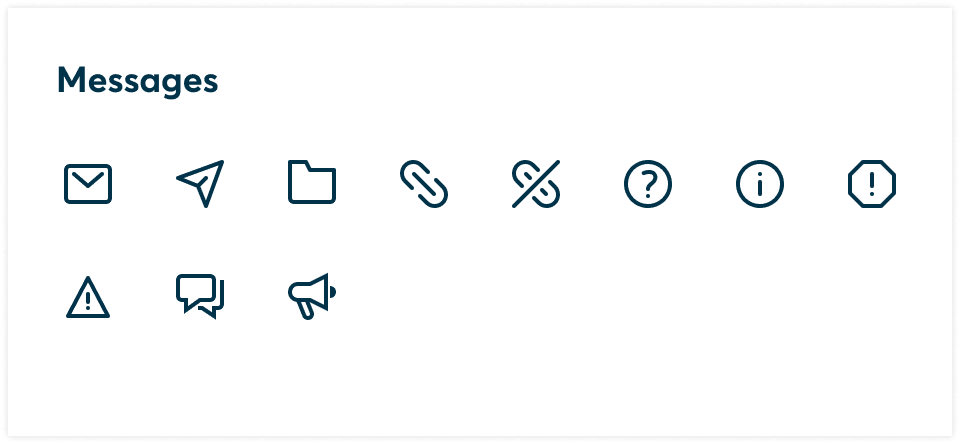
Iconography
Icons are visual representations of commands, devices, directories, or common actions.
Icons can be used to symbolize common actions, files, devices, and directories. Our design system contains stylistic variations of outlined icons, that can also be dynamically customized (weight, size, etc.).
Icons provide a visual representation of functions or actions, making it easier for users to recognise and understand them quickly. Icons can convey meaning and serve as a form of visual language, transcending language barriers and allowing users to interact with the software intuitively. Our icons are designed with our brand personality baked in.
Icon usage guidelines
Icons should be simple and clear, representing their intended meaning effectively. Avoid complex or ambiguous icons that can confuse users. Use familiar and universally recognised symbols whenever possible to ensure ease of understanding.
Maintain consistency in icon design throughout our product to create a cohesive and unified user experience. Use a consistent style, size, and colour scheme for icons across different screens and functionalities. A single icon should be used for a single concept.
DO
Use a single icon per concept
DON'T
Multiple icon variations should not be used for the same concept
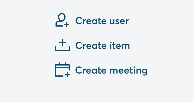
Combine icons with meaningful text labels to increase comprehension. Icons should be relevant to the actions or functions they represent. Connect the icon's visual representation to the associated action or app, ensuring that users can easily relate the icon to its intended purpose.
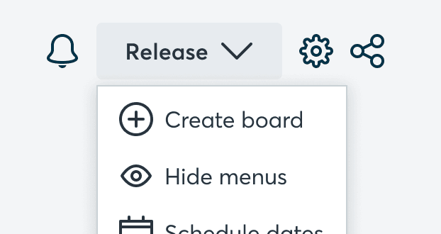
DO
Use icons with meaningful text labels
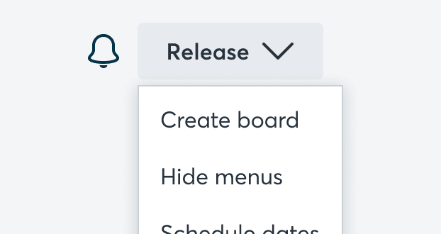
DON'T
Icons without labels can be unclear
Avoid using too many icons within a single interface or screen, as it can overwhelm users and create visual clutter. Use icons judiciously and combine them with text labels when necessary to provide additional clarity.
DO
Use a single icon for clarity
DON'T
Too many icons in UI create visual noise
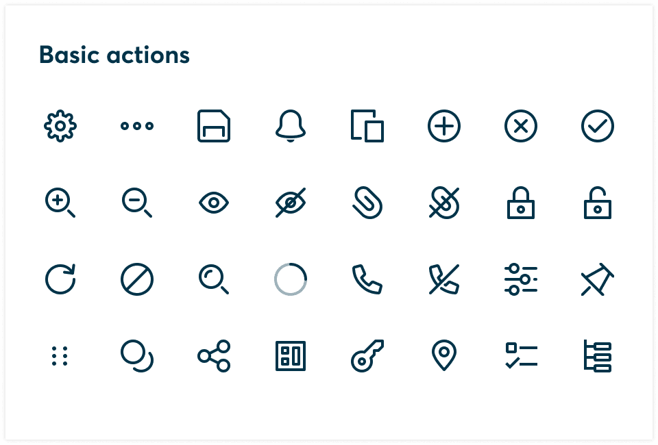
Icon Styles


Accessibility
Icons should be accessible to all users, including those with visual impairments. Provide alternative text or labels for icons, enabling screen readers to describe their function. Additionally, consider offering options for users to customize icon size or provide text labels alongside icons.
You should also consider the size and scalability of icons to ensure they remain legible and visually appealing across different devices and screen sizes. Test the visibility and clarity of icons on various resolutions and display densities to guarantee optimal user experience.