Spacing
A spacing system supports the creation of simple page layouts and understandable UI.
The consistent and intentional use of a spacing system creates a more harmonious experience for the end user. A spacing system also lays a foundation for responsive design and customisable UI density in the future, which will enhance the overall quality and accessibility of our products.
Small values - (0 to 8px) for small pieces of the UI
- Gap between icons
- Container padding of small components (i.e., icon buttons, table cells, badges)
- Gap between repeating elements (i.e., button groups)
- Padding within input components
- Vertical spacing between elements in a card
- Gap between the trigger and elevated elements (i.e., between dropdown button & menu)
Medium values - (12 to 24px) for less dense pieces of UI
- Container padding of larger components (i.e., buttons)
- Space between avatar icon and content (i.e., section messages)
- Vertical spacing between elements in cards
- Spacing between items in less densely packed or larger components
Large values - (32 to 80px) for the largest pieces of the UI and for layout elements
- The space between content on the page (i.e., spacing between top of page and header)
- Alignment within larger pieces of content
Spacing guidelines
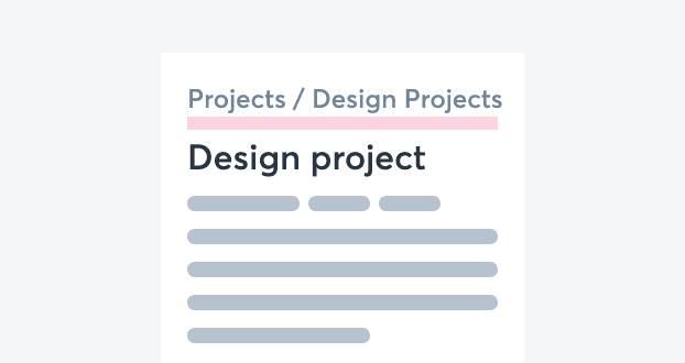
Group by similarity
Applied to Small + Medium size values (0 to 24px).
Users expect elements to be grouped semantically. Using consistent spacing around elements lends them a visual similarity that helps the user understand their semantic relationship.
DO
Group similar items together using similar spacing
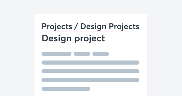
DON'T
Group similar items differently
Group by proximity
Applied to Medium size value (12 to 24px).
The distance between elements creates semantic meaning. Elements that are placed close to one another are assumed to be related. Use this principle to create meaning by placing more related objects close together, and less related objects further apart.
DO
Group related items close together so that users can scan the content more easily
DON'T
Group related items far apart
Group by order & hierarchy
Applied to Small + Medium size values (0 to 24px).
Users look for order in visual information to reduce the mental effort required to scan and process data. Therefore, the ordering of elements on a page can be used to encourage users to follow a certain flow or journey.
DO
Use scale and whitespace to rank elements
DON'T
Give every element the same visual importance